


Stay safe…. Stay alert…. Return to work….
The messages from Westminster are evolving in an attempt to find a balance between controlling COVID-19 and minimising the economic impacts. But the return to work message comes against a backdrop of recent rises in COVID-19 case numbers and a series of local lockdowns across the UK.


Leicester saw the first local lockdown at the end of June, while this week has seen visiting restrictions applied across councils in the Glasgow area, once again preventing households meeting up indoors. Such restrictions will create difficulties for those hoping, or expected, to return to work.In this blog we explore the historical case figures and the patterns that have led to localised lockdowns being introduced. We also introduce a method of monitoring patterns in case numbers, which can help spot areas of England which may be at risk of entering Public Health England’s watch list, as well as providing early warnings of a need to move from localised to national lockdowns.
The headline picture
What is driving the recent concern? The chart below shows latest (as at 3rd September) case numbers published by the UK government. The bars show the daily numbers of new COVID-19 cases across the UK, with the line showing the running seven day average, smoothing through dips in new case numbers which tend to happen at weekends.
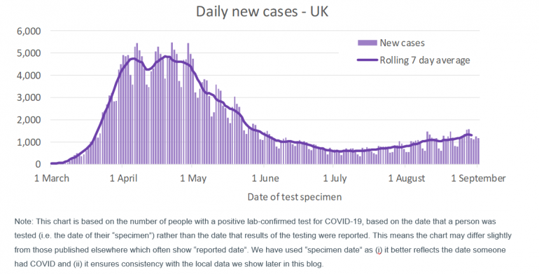
The chart shows that new cases rose rapidly in March, before levelling off in April as lockdown control measures took effect, and then declined from the start of May, enabling some easing of lockdown restrictions (in England at least). However, in recent weeks the cases have started to rise again, which is a cause for concern.
One of the features of the pandemic has been the need to rapidly increase testing capabilities and capacity. Much of the early media discussion centred on the government’s progress in achieving its stated target of 100,000 daily tests by the end of April. Capacity is now much higher being provided primarily through a combination of:
- NHS and Public Health England testing for those with a clinical need and health and care workers (“Pillar 1”); and
- commercial partners appointed to provide capacity for testing of the wider population (“Pillar 2”).
Total capacity levels often quoted also include antibody testing to identify if individuals have had COVID-19 (“Pillar 3”), and surveillance testing to enable research into the prevalence and spread of the virus (“Pillar 4”). Capacity across all four pillars is currently around 370,000 tests daily, although capacity for the primary testing for monitoring current infection levels (Pillar 1 and Pillar 2) is likely to be closer to 200,000 tests daily.
The daily new cases chart above covers the results from combining Pillar 1 and Pillar 2 testing, although Pillar 2 testing was minimal prior to May. The increase in capacity means that over time more people have been able to be tested, and so more cases can be identified each day than at the outset of the pandemic.
Despite the potential distortion to the chart caused by changes in capacity, the rise in cases since early July is of concern. Throughout this period testing capacity has been consistently high at around 200,000 per day across pillars 1,2 and 4 and over 300,000 per day across all pillars. Over 140,000 tests to assess current infection levels (Pillar 1 and 2) have been processed daily.
The rising case numbers have the potential to place further strain on health services and lead to additional loss of life from COVID-19. So far COVID-19 deaths have continued to decline rather than rise over recent weeks. Anecdotally, the fall in COVID-19 deaths despite the rise in cases appears to be a combination of a greater understanding of the most effective treatment methods, differing characteristics of individuals currently contracting COVID compared to earlier in the pandemic (typically younger with fewer comorbidities) and more asymptomatic cases being identified via the “NHS Test and Trace” system now in place in England (and similar schemes in the rest of the UK).
Despite not (yet) seeing a surge in COVID-19 deaths, the rising case numbers are a reminder that we don’t yet have the virus under control. However it is reassuring that the growth in case numbers over recent weeks is relatively slow compared to earlier in the year. This suggests that, while there may be some areas seeing more rapid rises in cases, this is being dampened in the national figures by measures such as social distancing continuing to abate more widespread transmission of COVID-19. Whilst this remains the case, we expect localised lockdowns will be used to contain the virus in a targeted manner. If, however, the national case numbers start to rise more rapidly, there is a real risk that we could see a return to a national lockdown.
Local lockdowns across the UK
Leicester was the first place in the UK to enter localised lockdown at the end of June. Since then local lockdowns have impacted many towns and cities in northern England, including Blackburn, Bradford, Oldham, Pendle, Salford, Trafford and Wigan. In some cases whole areas have entered lockdown, while in others specific wards within that local authority have had restrictions placed on households meeting up (for example the local authorities of Calderdale and Kirklees in West Yorkshire). Scotland has also seen local lockdowns; Aberdeen entered local lockdown on 5th August and very recently additional restrictions have been placed on councils in the Glasgow area. So far, no local lockdowns have been introduced in Wales or Northern Ireland.
Using data available at the local authority level for cases over time, it is easy to see why many of these areas have entered lockdown, and why the timing of restrictions being applied has differed. For the purposes of this blog we have focussed on the data for England, although - subject to data availability and comparability - we hope to extend our commentary to cover the other home nations in future blogs.

All the charts in the rest of this blog are based on lower tier local authority data downloaded on 3rd September 2020. The data used covers testing on specimens collected up to and including 1st September 2020. However, to allow for the time lag in processing these tests and the information be added to the central statistics, our analysis covers tests collected up to and including 30th August 2020.
The charts below show the daily new cases for three local authorities. To control for differences in population numbers between local authorities, the case numbers are shown per 100,000 of population. In each chart the grey line is the average level of new cases across England. The charts are simplistic – in that, whilst we control for different population sizes, we make no attempt to control for the risk factors associated with COVID-19 which can vary between local authorities (such as age and socio-economics). Never-the-less they serve a useful purpose in indicating how prevalent COVID-19 is in each area.
The three local authorities we have chosen to look at are (the London Borough of) Brent, Leicester and Pendle. We have chosen these particular authorities as they illustrate a number of different patterns.
London Borough of Brent
Brent received considerable news coverage during the early weeks of the pandemic. It was initially one of the hardest hit parts of the country in terms of cases, hospitalisations and deaths. This is very apparent when we consider the daily new case numbers in the chart below.
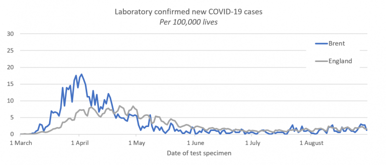
Brent saw a sharp initial rise in cases, with confirmed cases over 3 times higher per capita than across England by early April. Since then daily new case numbers have declined to below (and most recently around) national levels. The chart also highlights how the peak in cases nationally happened several weeks after the peak in the initial hotspots (which tended to be in London and Birmingham metropolitan authorities).
Leicester
Leicester was the first place in the UK to go into local lockdown. From the chart below it is clear why this was needed:
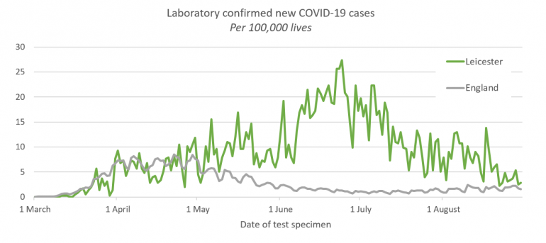
Although the peak in Leicester is significantly higher than for Brent, care is needed in comparing different time periods, since testing capacity rapidly expanded between March and July. In early April, when Brent was reaching its peak, national testing capacity was just over 15,000 tests daily, and exclusively Pillar 1 testing i.e. for those with clinical need or working in the health and care sector. By early May capacity had reached 100,000 tests per day (roughly evenly split between Pillar 1 and Pillar 2), and by early June capacity had reached 200,000 through widening the reach of Pillar 2 community testing and the introduction of Pillar 3 testing. Consequently, for the same level of COVID circulating in the community, a higher level of positive test cases is likely to be reported in these later months.
Ivan Browne, Director of Public Health for Leicester, notes in this webinar his reaction when he and his team started to observe rising cases in June. Initially, they wondered if the rise was due to this increased capacity and availability; but they suspected that it was more than this. They asked for support from Public Health England (PHE) to help explore their concerns. By June 17th more complete data was available from PHE and it became clear that the “figures were definitely at odds with the rest of the country”1, leading to extended local lockdown being introduced from 30th June. Since then daily new cases in Leicester have steadily declined, although remain double the national average.
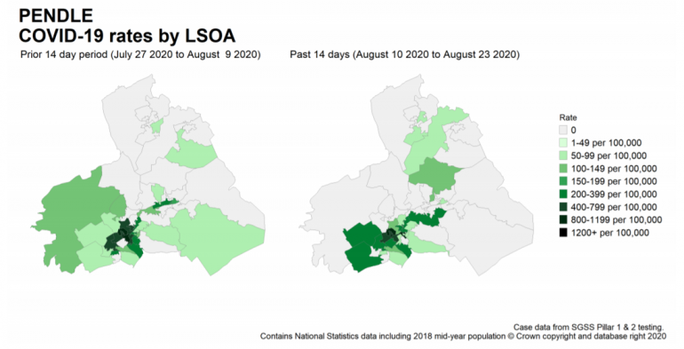
Pendle
Pendle is illustrative of the rise in new cases seen in local authorities which have more recently entered local lockdown.
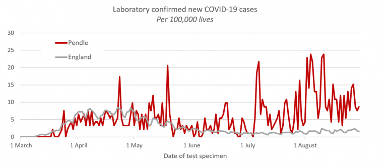
Whilst Brent and Leicester have populations in excess of 300,000, Pendle has a population of less than 100,000– consequently its new case numbers per capita show greater volatility. However, a general pattern is clear.
Following the initial “hump” of cases at the peak of the pandemic, Pendle saw a modest drop in daily new cases during late May and June before a significant rise in new cases during July and August. Whilst not quite reaching the same level of daily new cases per capita as Leicester experienced at its worst, it is never-the-less seeing new cases many times the national levels and is clearly of concern.
Under surveillance
The publicly available data on COVID-19 cases is much improved since Leicester was first trying to get a handle on its rising case numbers. Public Health England publishes a weekly surveillance report, as well as maps of the areas where it has concerns, drilling down to micro-regions within local authorities (known as Lower Layer Super Output Areas, “LSOA”).
The map for Pendle in the latest report (Week 35, 28 August 2020) highlights the characterising features of the “lockdown” local authorities: that there are “hotspots” (dark green) within these authorities where outbreaks are concentrated, but that these “hotspots” tend to move over time as transmission happens within that local community.
The same surveillance by PHE also produces a “watch-list” of local authorities across England, split into three categories:
- Intervention: These authorities have specific restrictions in place which are more limiting than those in place for England generally i.e. there is some form of local restriction (“lockdown”).
- Enhanced Support: The local authority is gaining additional support and resources from central government, including increasing mobile testing capacity.
- Concern: Highlighted as having high prevalence of COVID-19, the local authority is taking additional targeted actions in order to control COVID-19 case numbers. This can include additional testing in care homes and increased community engagement with high risk groups.
Roughly 14% of the population of England is living in areas highlighted in the latest watchlist. Just one new area was added to the list compared to the preceding week (Stoke-on-Trent, into the “Concern” category), while three moved from “Concern” to “Enhanced Support” (Swindon, Birmingham, and Sandwell). The list also saw the watch level reduced for several local authorities from “intervention” to “enhanced support” – leading to residents in these areas looking forward to increased freedoms from the end of this week. Unfortunately for those living in Bolton and Trafford, subsequent events have led to a reversal in this decision – we return to this later in the blog.
Are we heading for a national lockdown?
Earlier this week, Matt Hancock cautioned that we may see a return to a national lockdown; despite Boris Johnson having previously likened to this to a “nuclear deterrent” that he didn’t think he would need to use.
Given less than 1 in 7 of people in England are living in areas highlighted in last week’s watchlist, a national lockdown does not seem imminent. However, the virus is clearly still with us, and the concern is the local “hotspots” could ‘merge’ and as a result national case numbers could start to grow very rapidly.
To help us understand these local hotspots we have been analysing the case numbers (per 100,000 of population) reported for each local authority in England. We have focussed on two specific characteristics:
- Severity of hotspot: How many new cases have there been over the last seven days compared to the national average2. Those areas where this is particularly high are “local hotspots”.
- Weekly change: How much higher (or lower) were the new cases over the last seven days compared to the previous seven days? Areas where there is strong local growth are of potential concern as this may indicate the start of a new local outbreak.
We can visualise these measures by plotting each local authority on a scatterplot. A stylised version of this is shown below, showing how to interpret each of the four “quadrants” where individual authorities might be positioned.
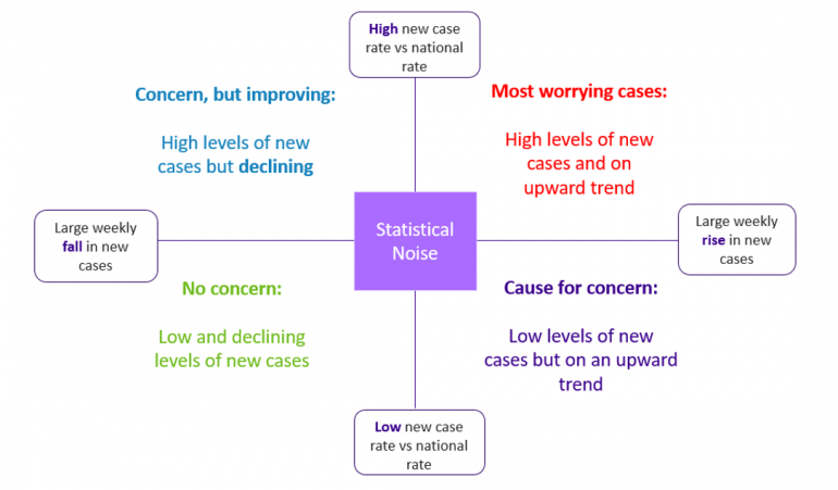
Whilst we only have localised outbreaks, we would expect a small number of local authorities to be high on one, or even both measures. Most local authorities would then appear in the bottom left quadrant of the chart, or close to the intersection of the axes (within an area of statistical noise associated with week on week variability in new cases).
If we start to move towards widespread outbreaks then we would expect a lot of authorities to be showing high weekly changes, but there would be fewer severe “hotspots” as the national average would also be higher. This would show up on the plot as the majority of the local authorities appearing in the top right quadrant (although mostly relatively close to the ‘x-axis’).
So, what do we currently see for the seven days ending on 30th August 2020?
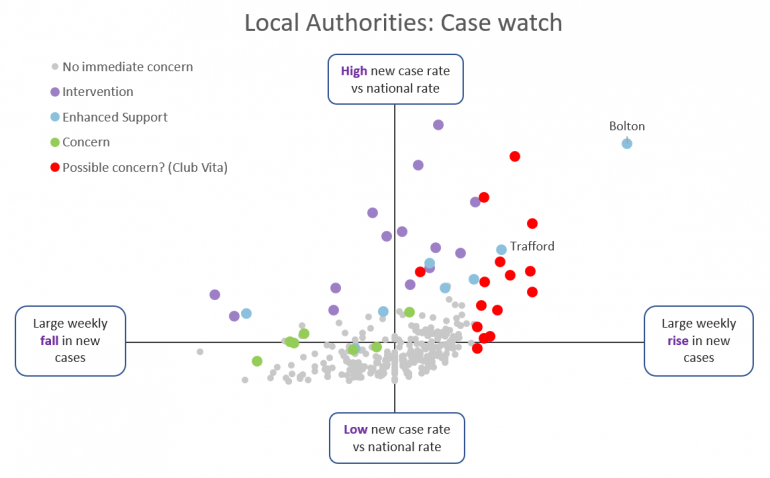
Whilst reassuring that most local authorities (271 out of 315; covering over 80% of the English population) are not of any immediate concern (the grey dots), there is a significant number of authorities appearing in the top right quadrant. We can see via the colour coding how:
- Those local authorities where Public Health England have interventions in place (purple dots3) or enhanced support (blue dots4) generally have high new case levels compared to the national rate and so it is clear why interventions are happening. However, for many of these authorities cases remain on the rise, and this is clearly a concern where “enhanced support” and “intervention” have been in place for some time.
- Following a decline in new cases, Bolton and Trafford moved from “intervention” to “enhanced support” in the latest watchlist, and were due to see easing of local lockdown. However, this easing was reversed on 2nd September. Looking at their position on the chart – high levels of new cases, and strong growth in case numbers – shows the concerns that PHE will have had with easing their local restrictions as planned.
- The local authorities which Public Health England have identified as of “concern” (green dots5) generally have elevated case levels although it is reassuring that many are seeing falling numbers of new cases.
- A small, but growing, number of other local authorities (15; covering around 5% of the English population) for which the data suggests to us in Club Vita that they may also be of emerging concern (red dots). These all have high levels of new cases compared to the national rate and/or very large (and statistically significant) rises in the local weekly new cases6.
The authorities marked in red may not all be of concern to PHE. Some of these may turn out to be simply “statistical noise”, despite having high levels of new cases / growth in new cases; however there are more authorities highlighted in red than we would expect for it to be pure noise. Some of these authorities may also have very specific local, contained outbreaks (such as we saw in July with a group of farm workers near Malvern). We suspect that those of most immediate concern to PHE may be those furthest towards the upper right-hand corner, namely: Breckland, Corby, Great Yarmouth, Hertsmere, Leeds, Rossendale, South Tyneside and Wirral.
What next?...
As many of us return from our summer holidays (domestic or overseas), gradually return to work where possible, and schools reopen across the UK, so the risks of community outbreaks inevitably rise. Soon the winter season will also be upon us, where traditionally we interact indoors more, and the winter flu and cold seasons may assist respiratory transmission (although this may be offset by continued social distancing behaviours). It seems likely that there will be upward pressure on new cases in the weeks ahead.
Whilst we may not currently be on the cusp of widespread national lockdown, close monitoring of local case numbers and effective test and trace mechanisms will be central to the UK’s battle to contain COVID-19. At Club Vita we will continue to closely monitor case numbers and the loss of life from COVID-19 through our regular blogs.
Notes:
1. See also: https://www.dmu.ac.uk/about-dmu/news/2020/july/dmu-ivan-browne.aspx
2. We present this as a percentage of the national average for the preceding seven days. This controls for growth in local rates influencing the national rate, especially when many local authorities are seeing a rise in cases.
3. Blackburn with Darwen, Bradford, Bury, Calderdale, Kirklees, Leicester, Manchester, Northampton, Oldham, Pendle, Preston, Rochdale, Salford and Tameside.
4. Birmingham, Bolton, Burnley, Hyndburn, Sandwell, Stockport, Swindon and Trafford.
5. Luton, Newark & Sherwood, Oadby and Wigston, Peterborough, Slough, Stoke-on-Trent and Wakefield.
6. In highlighting rapid growth rates we have allowed for the level of new cases in that area and the size of the population to avoid highlighting local areas where the change may reasonably be attributed to statistical noise.