


We take a closer look at the CMI’s latest projection of lower life expectancies and the impact this will have on scheme liabilities.

Recent years have seen increases in numbers of deaths (which had previously been falling), although in part this is due to the aging population. The CMI_2017 model reflects (more of) this relatively heavy experience, as it allows for experience to 2017. It will therefore generate lower improvements than CMI_2016, which will equate to lower life expectancies and lower liabilities than previously predicted.
Care should be taken before rushing to reflect this adjustment, particularly for scheme funding decisions. It is important that schemes consider both the relevance of population level data to their membership, and the extent to which possible drivers of recent experience could continue in the future, when considering assumptions for future improvements
Background
The CMI have published the latest version of the CMI
Mortality Projections Model, CMI_2017. This model has become the industry
standard when projecting mortality improvements into the future. In essence,
the model takes initial rates of improvement, derived from historical data, and
projects them to a (user specified) long term rate. Users have the option of
either using the ‘core’ parameterisation, or else varying the parameters to
adjust the way the model is fitted to historical data and/or the way the
initial rates are projected to the long term rate.
The main change in this latest version is the data used to calibrate the core model (and so derive initial rates of improvement). As before, this is based on England & Wales population data, as published by the ONS. However it has been updated to include data in respect of 2017 (and so is calibrated to 1977 to 2017, rather than 1976 to 2016 used for CMI_2016).
Exploring recent experience
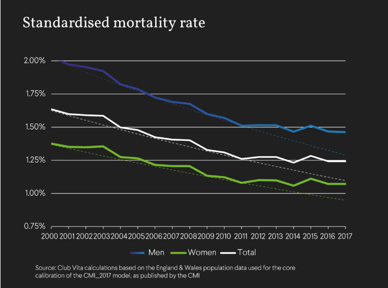
An individual’s mortality rate is the probability that they will die in the following year; these rates differ by age and gender. To consider how mortality rates change over time, we can use the annual Standardised Mortality Rate (‘SMR’). This is essentially the mortality rates at different ages averaged over the same ‘standard’ population. A fall in SMR indicates increasing life expectancy as overall people are less likely to die in the following year.
Using the SMR gives us a better understanding of how mortality is improving over time than simply looking at the annual number of deaths. This is because the England & Wales population is aging (i.e. the average age is increasing over time). Therefore, if mortality rates were unchanged from one year to the next, we would still anticipate an increase in the number of deaths over the year of around 2-3%.
Looking at how the SMR has evolved over time, as shown in the chart below, we can see how it fell relatively steadily over the 2000s (the dotted lines are the average annual increase from 2000 to 2011, applied to the SMR in 2011), but the last few years have seen much slower improvements.
Fitting to historical data in the CMI model
The chart below illustrates the initial annual improvements to mortality rates at different ages that result from the core parameterisation of the CMI_2017, for men and women. These are the improvements that are assumed to apply in 2017. We show the corresponding initial annual improvements from CMI_2016 for comparison.
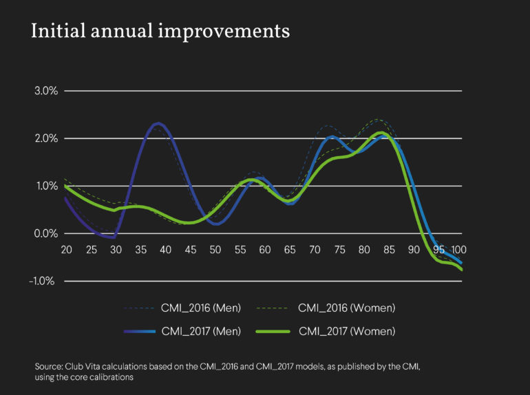
We can see above that the initial rates for CMI_2017 are lower than the corresponding improvements from CMI_2016 for nearly all ages, for men and women. This is primarily due to the impact of introducing 2017.
Resultant life expectancy
The chart below shows the impact of moving from CMI_2016 to CMI_2017 on (cohort) life expectancy at a range of ages (as at 1 January 2018), using S2 base tables and assuming a long term rate of 1.5% p.a. in each case.
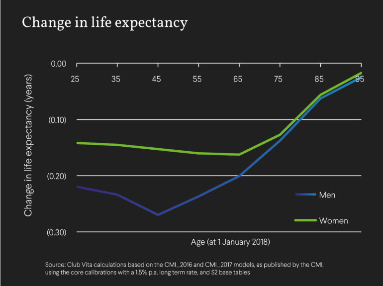
Given the reduction in initial annual improvements, it is unsurprising that the resultant life expectancies are lower under CMI_2017 than under CMI_2016.
Implications for pension schemes
Schemes which adopt the core CMI_2017 model when setting mortality improvements will see a reduction in liabilities relative to previous core versions of the model, which sounds like good news from a funding perspective.
However we would sound a note of caution – the above analysis is based on population data for England & Wales, and schemes should consider the appropriateness of applying such improvements to their pension scheme membership. In particular, our analysis has shown that, not only have members of pension schemes generally seen different experience to the wider population over the 15 years to 2015, but in particular different socio-economic groups have seen different experience over that period. We found that those in higher socio-economic groups, who are likely to account for the bulk of most schemes’ liabilities, have been less impacted by recent heavy experience.
Understanding the potential drivers of this differing experience, as well as the appropriateness to their membership, can help schemes form a view on appropriate assumptions to adopt, as so reach a more informed decision.